January 2016 Staging Tip of the Month

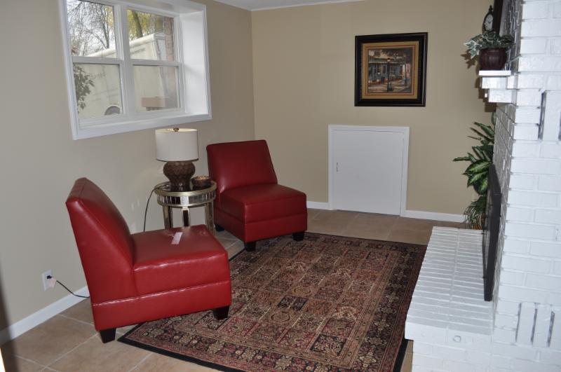
Overly traditional or contemporary furniture can make buyers feel like the home itself is that style and may be a turn off for them.  It’s better to use furniture with a transitional style so it will appeal to the largest range of buyers.
Below, you can see how the simple lines of this furniture allow buyers to see the amenities of the home.  We also arranged the furniture to make the room feel very spacious and open to the adjoining dining room.

December 2015 Featured Before & After

We did a consultation for this home that had been on the market for a very long time.  To help the home appeal to the less traditional buyer, we had them paint the walls a warm grey which showed off the white trim and mantle. Instead of differentiating the traditional inset details, we had them paint the whole wall the same color.  We also eliminated the extra rug and some art and accessories to show off the beautiful wood floor and give a simplified feeling.  It sold right away!
   BEFORE
AFTER

December 2015 Staging Tip of the Month

When we are helping people get their homes ready for sale, they often don’t have the extra funds to add new furniture pieces that would help the home look it’s best.  Reusing existing furniture is sometimes the only option, and with this tip, dated furniture can actually look great!   All credit goes to one of my favorite bloggers: Confessions of a Serial Do-It-Yourselfer.

November 2015 Staging Tip of the Month

I don’t often advocate for painting brick because there is no going back if styles change.  But here the fireplace was becoming a distraction to the room.  It was heavy and dark and made the room feel small.

The investor that flipped this house painted the fireplace white and the brass screen black.  Now the room is open and bright and the fireplace is a beautiful focal point!

October 2015 Featured Before & After

This bathroom is the from the same home as the bedroom in the last post.  Before, the colors were very uniform and the accent blue tile seemed out of place.  By using a richer wall color, we created a contrast with the tile and woodwork to show it off.  Then adding blue art and accessories, we made the accent tile an integral part of the space.
   BEFORE
AFTER

October 2015 Staging Tip of the Month

The buyers of your home will most likely use the master bedroom, so spend your time and money making it look the nicest of all the bedrooms.

Before, this room was okay, but we wanted it to feel even more inviting and serene.  A little softer color on the wall, a seating area and the pale blues in the bedding, lamps, pillows and art all work wonders.  The biggest transforming piece however, was the draperies which add both height and softness to the room!