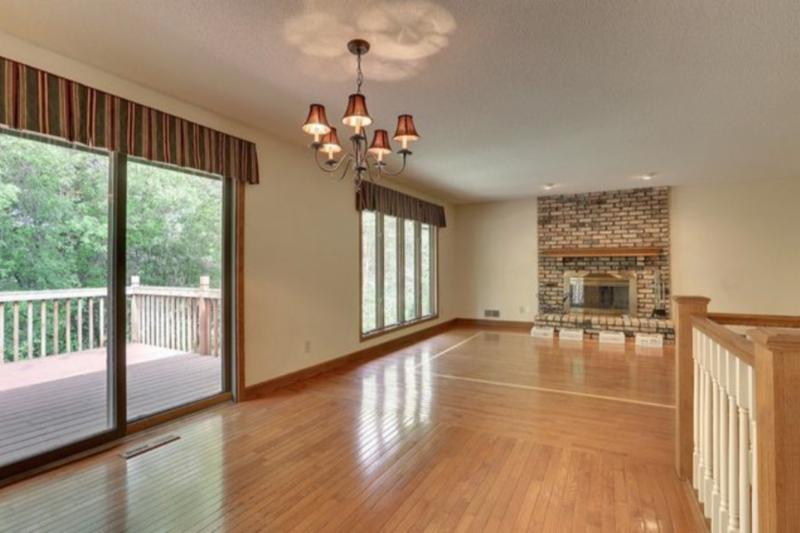
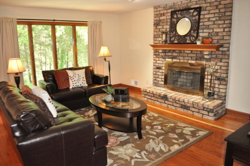
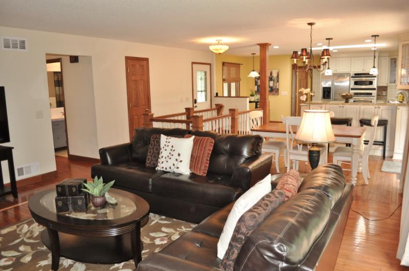
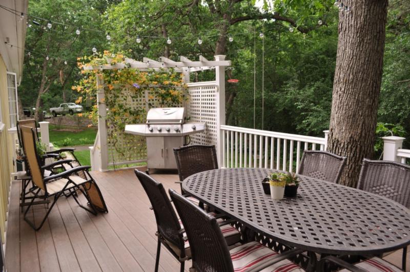
Large open spaces are some of the hardest for buyers to envision how they would lay out their furniture in the space. Staging always helps these types of spaces. If you don’t have the budget to rent furniture, consider using pieces from your own home or borrowing from friends or family!
June 2016 Featured Before & After
With no furniture, buyers can sometimes be concerned about how furniture might fit.
BEFORE
AFTER
Now, buyers can clearly see how the furniture can be positioned in the space.
June 2016 Staging Tip of the Month
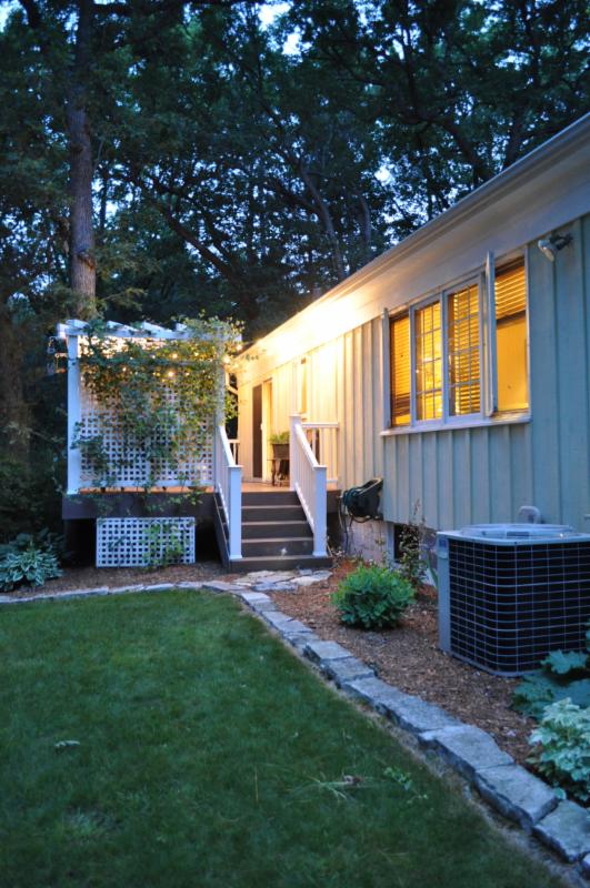
If you plan to list your home in the winter or very early spring before everything is green, take outdoor photos now while everything is beautiful. Take photos of gardens, outdoor structures, wildlife that frequent your yard and overall views of your house. Twilight photos with all the lights on inside the home also give a great impression. Keep electronic versions of the photos that you can send to your Realtor to use in the marketing.
May 2016 Featured Before & After
This Big Lake model went from new construction to welcoming new home with the addition of our rental furnishings!
BEFORE
AFTER
May 2016 – Win a Gift Card!
Houzz is a great website for interior design and home staging inspiration and now you can review Home Stagers there too. So if you’ve ever used our service, just write a review about our service and be entered into a drawing to win a $100 gift card to HomeGoods. The review must be complete before May 31, 2016.
April 2016 Featured Before & After
This is from the same house in the last post. Before the red accent paint and draperies were a little jarring for buyers. The custom wallpaper mural was too personal. And the traditional rug with the traditional furniture was a little overwhelming for a more contemporary buyer.
BEFORE
AFTER
The mural was removed, the red got painted neutral, the red draperies removed and the traditional rug replaced with a more contemporary one. With this room right inside the front door, this is a much better first impression!
And a few more after pictures of the rest of the house:
BEFORE
AFTER
BEFORE
AFTER
April 2016 Staging Tip of the Month
Rooms need to have “softness”. Before the bright green walls created a hard, stark contrast against the dark furniture.
We had the homeowner paint the walls a much softer wall color, created a more conversational seating arrangement and added lots of softness with pillows, lamps and accessories.
March 2016 Featured Before and After
This is from the same condo as the kitchen in the last post. White walls, dark oak trim and tired carpeting did not make this condo stand out above any of the others in the building. We closed off the opening to the kitchen, added booth seating since this condo lacked storage, painted everything, added new flooring, lighting and beautiful furniture.
BEFORE
AFTER
And a few more after pictures of the rest of the condo, just for fun!
March 2016 Staging Tip of the Month
An older galley style kitchen with minimal storage can often be difficult to envision any other way.
This one got a beautiful makeover! We didn’t replace cabinets….but instead added a pantry where an opening was and put new cabinet fronts so they would all coordinate. New flooring, appliances, countertops and backsplash make this kitchen a wow statement!
February 2016 Featured Before & After
Before selling the homeowners used this sunroom as a playroom. In homes with lots of bedrooms, it’s fine to show some play areas because most buyers will likely have children. But for this beautiful room, it wasn’t showing the space to it’s full potential. We brought in a seating area and minimized the play area to really show off the space.
BEFORE
AFTER